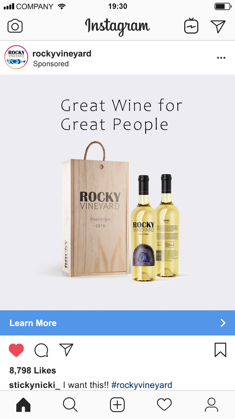
The Project: Design packaging for wine bottle labels and multi-platform advertisements.
Company: Rocky Vineyard is a small winery located in the interior region of British Columbia who focus on perfecting the best quality wine in each bottle they make. They specialize in the wine making process when it comes to the aging stage and they only use the finest wooden barrels hand selected from Italy.
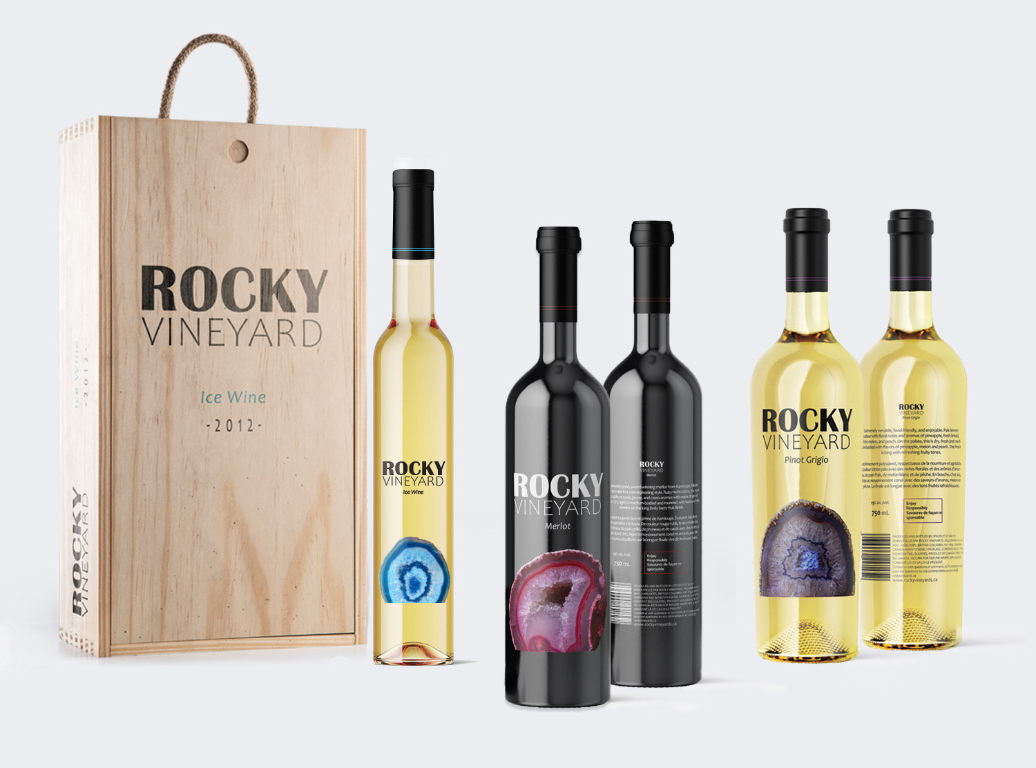
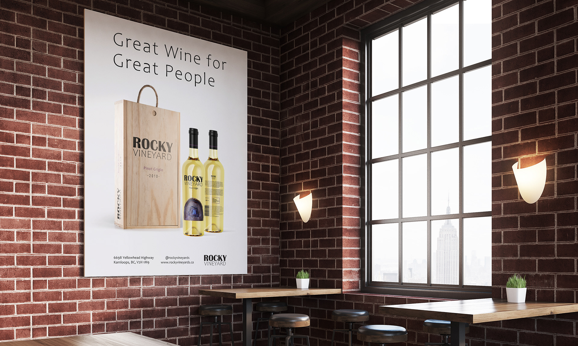
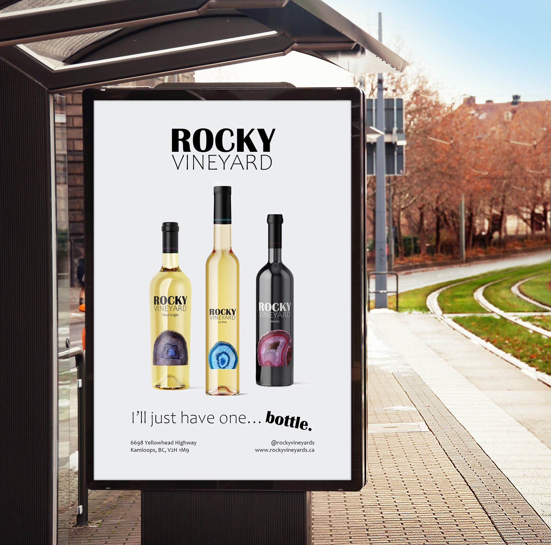
Design Concept: We wanted to showcase our wine in a way that was unique to others but still having a traditional take. We decorated our bottles with beautiful geodes. The reasoning for this is because the geode forming process and wine making process are similar in the sense it is an art. You can fail at making the perfect bottle, but you can also succeed at it. This is a long and hard process to perfect and is not something you can do overnight but it’s worth the wait!
Wine Label Flats
Pinot Grigio, Merlot, Ice Wine
Pinot Grigio, Merlot, Ice Wine

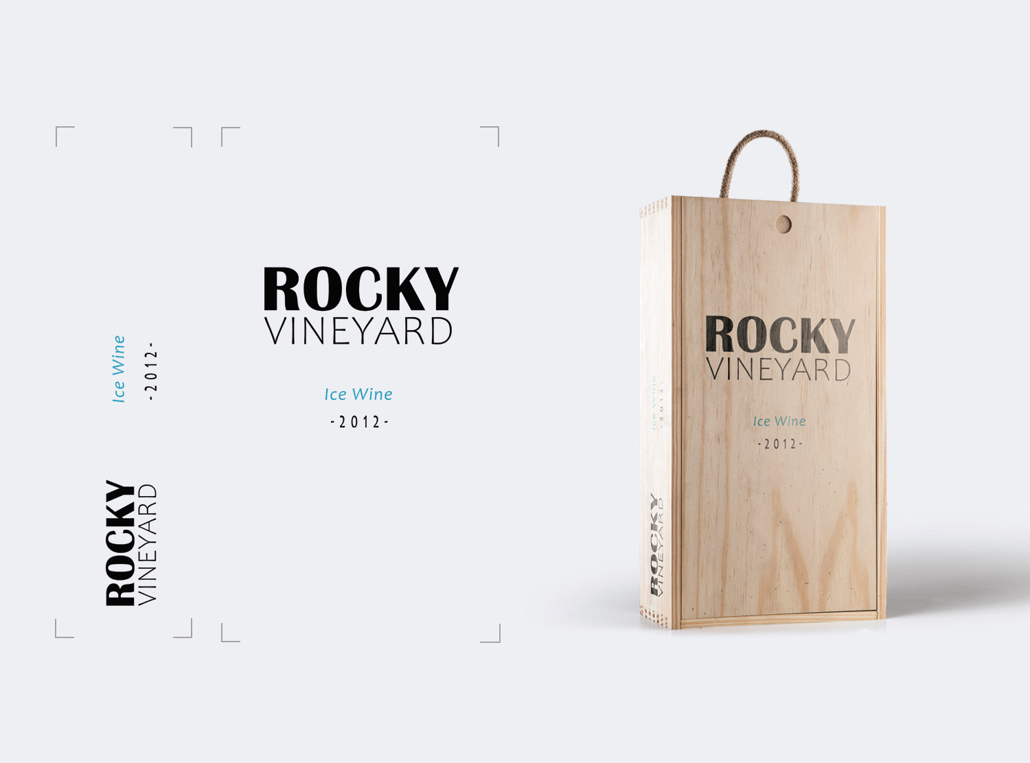
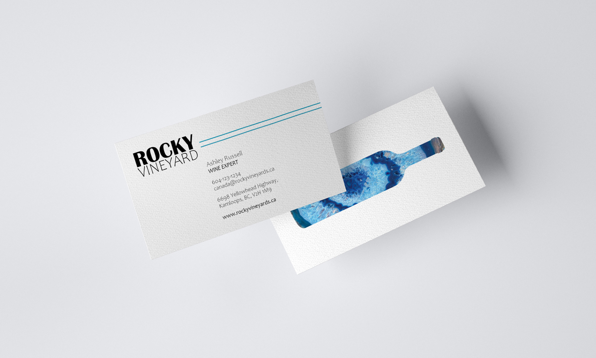
Typography: We went with a strong bold font choice for the logo because we wanted to show that we are strong and powerful in our choosing. We wanted to word ‘Rocky’ to stand out for more than one reason. This font choice has that nice bold effect while still giving some softness with the curve in the R. The C also showcases the bold center and lightens up coming to the edges. This font choice beautifully displayed are rock love and delicacy all in one. We paired the Britannic Bold with a soft light font which also has some nice curves and a unique quality to it.
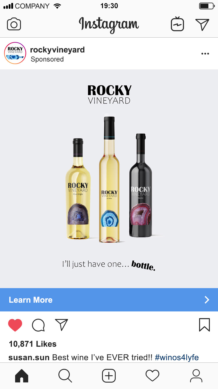
Colour: We stuck to the geode’s natural colour palettes and have gone with three different geodes colours to represent our three new wine releases.
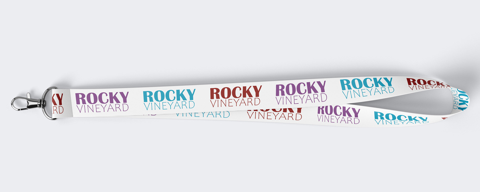
Custom Stamp, Accessory Item, Business Card

Programs Used: Adobe InDesign & Adobe Photoshop
Timeline: 3 weeks