This is a mockup design for a school project and is not related to Unity Clothing Co. The purpose of this project was to choose a business that we loved and rebrand it. Unity Clothing is one of my favorite stores that is locally owned. The design was not meant to offend anyone and is solely to display design and branding skills.
The Project: Design a comprehensive branding and promotional campaign package for a local business.
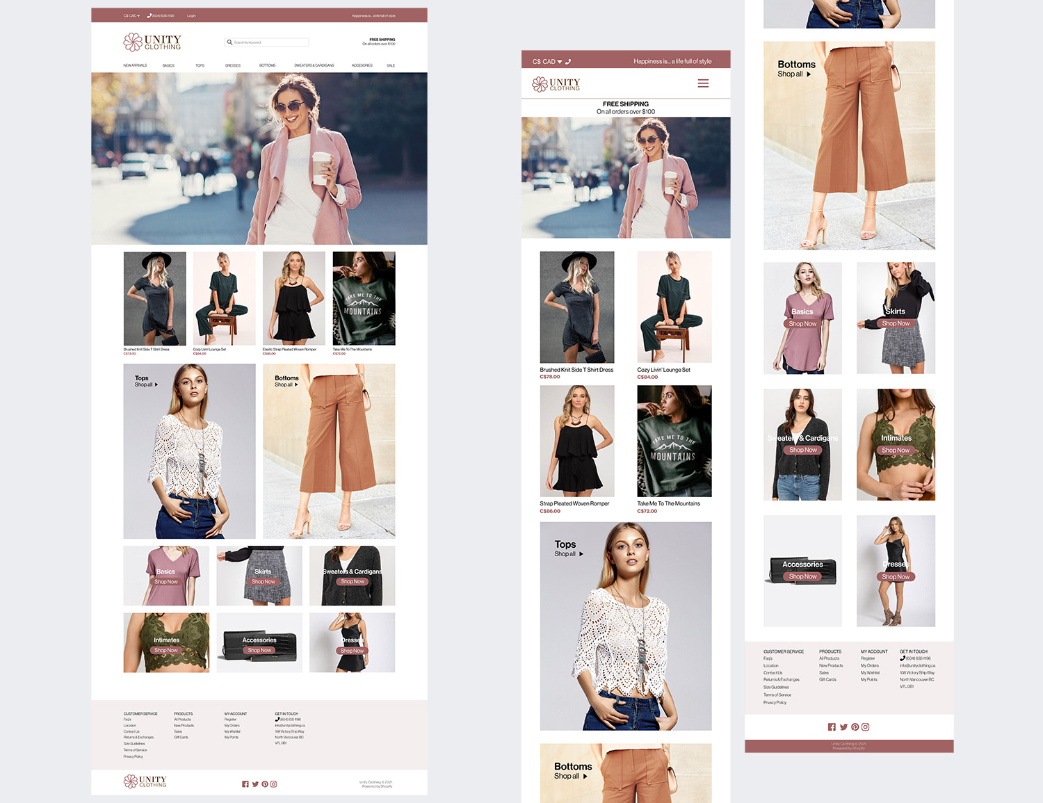
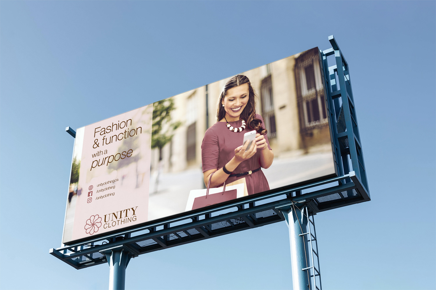
Design Concept: Unity Clothing is a store located in the heart of North Vancouver at Lonsdale and Victory Ship Way, they are inspired by the latest trend pieces and by people coming together who share the same passion for fashion.
Unity means “the state of being united or joined as a whole”
The logo icon represents the top part of a clothes hanger that is coming together and united as one whole.
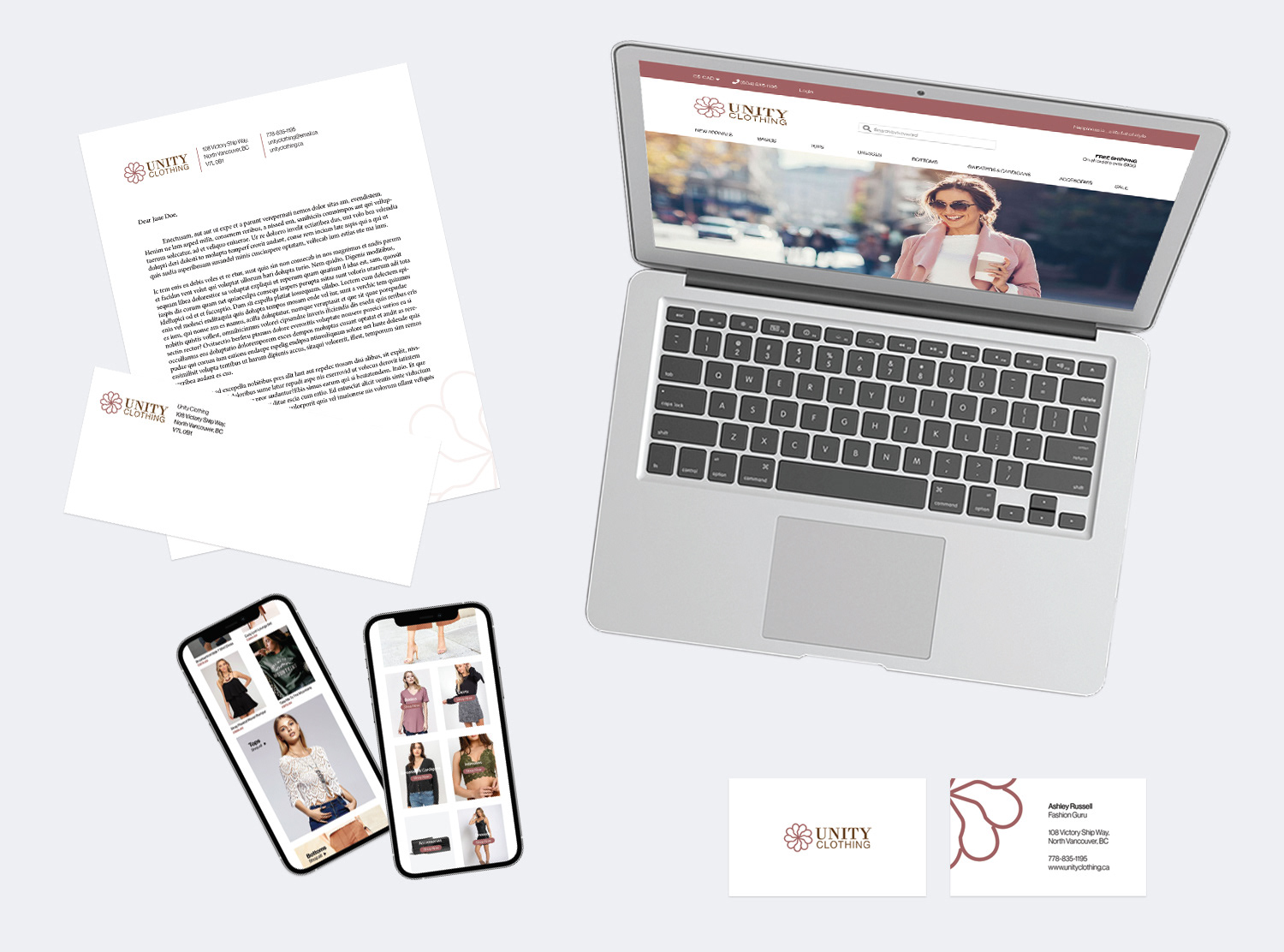
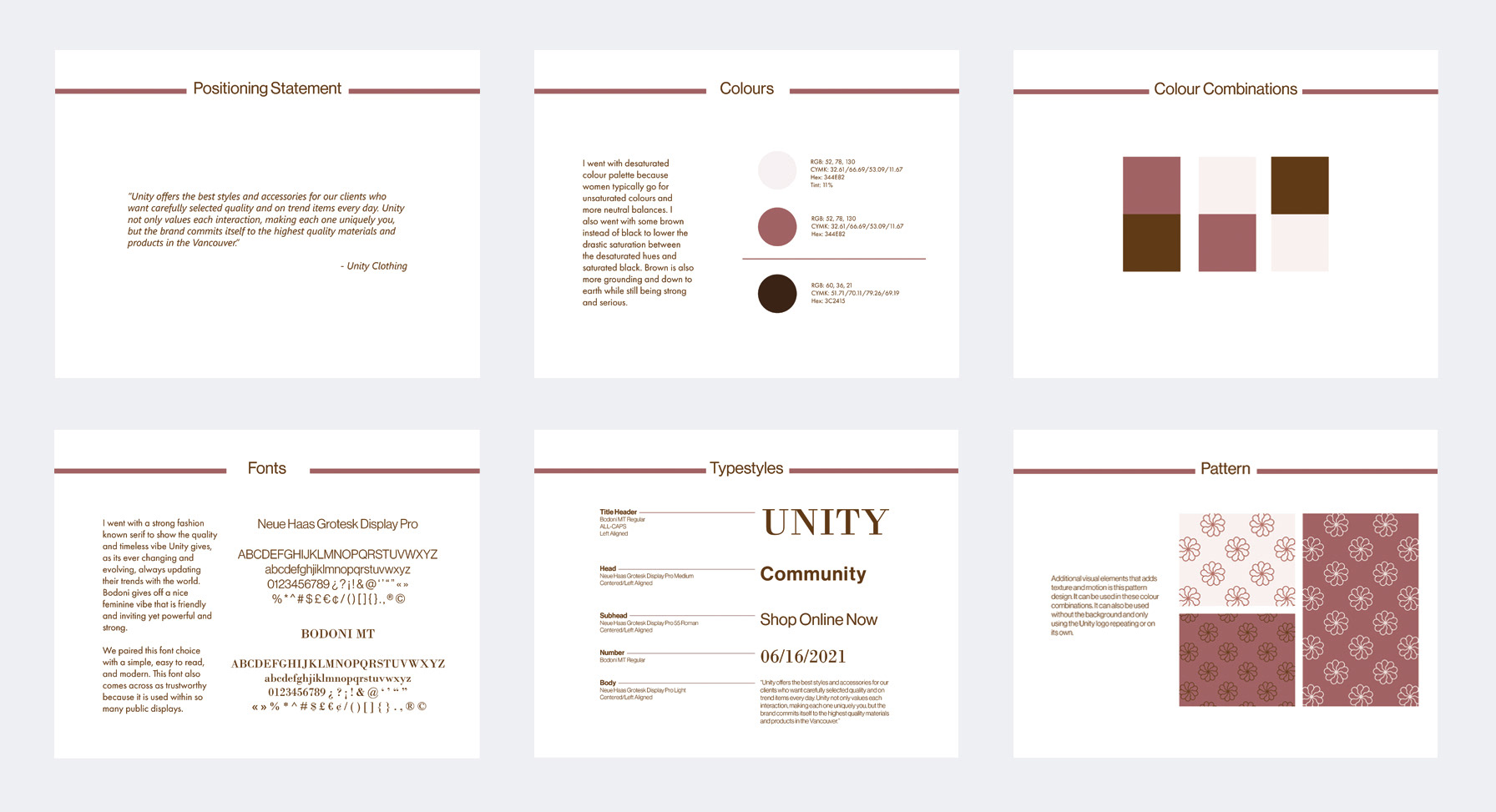
Typography: I went with a strong fashion known serif to show the quality and timeless vibe Unity gives, as its ever changing and evolving, always updating their trends with the world. Bodoni gives off a nice feminine vibe that is friendly and inviting yet powerful and strong. We paired this font choice with a simple, easy to read, and modern. This font also comes across as trustworthy because it is used within so many public displays.
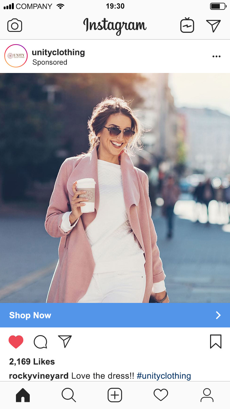
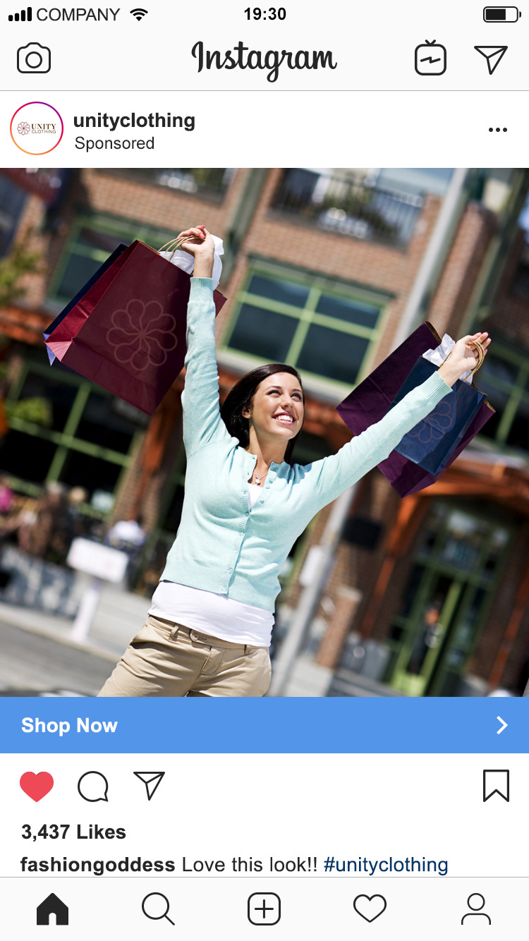
Desktop, Mobile
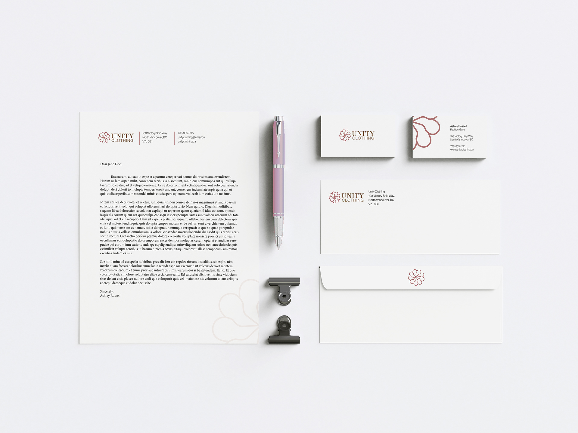
Paper Bags with Cute Message Insert, Stationary
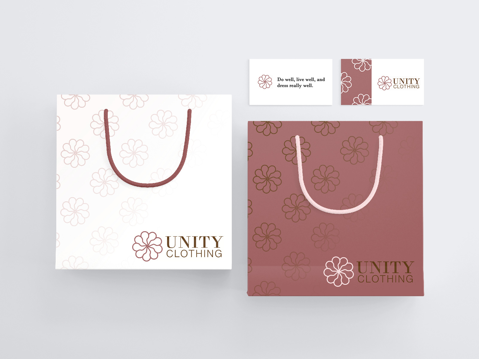
Colour: I went with desaturated colour palette because women typically go for unsaturated colours and more neutral balances. I also went with some brown instead of black to lower the drastic saturation between the desaturated hues and saturated black. Brown is also more grounding and down to earth while still being strong and serious.
Slides from Re-Branding Guide, Logo Exploration

Programs Used: Adobe Illustrator, Adobe InDesign & Adobe Photoshop
Timeline: 9 weeks